

The original ISOM logo (left) has served well for the past 30+ years. The new logo (right) is simplified, contemporary, and reflects the organization’s vision moving forward.
- 治療法・栄養
ISOM Launches New Logo
目次
30年以上にわたり愛用されてきた国際オーソモレキュラー医学会(ISOM)のロゴがリニューアルされました!
The 3-dot molecular graphics replace the ‘O’, pointing left and right to signify forward movement and connection to the past. The colour green represents natural molecules and nature, and blue represents trust.
This graphic is also a variation of the familiar “connect/share” app symbol, which aligns with ISOM’s mission of connecting orthomolecular organizations, medical professionals, and the public; and sharing educational resources designed to improve health outcomes.
Look for the new logo to appear in ISOM communications, on the website, and in other applications.

オリジナルのISOMロゴ(左)は、過去30年以上にわたって活躍し、新しいロゴ(右)は簡素化され、現代的で、前進する組織のビジョンを反映しています。
3ドットの分子図形はISOMの「O」に代わり、左右を指し示し、前進と過去とのつながりを意味します。緑は自然の分子と自然を、青は信頼を表しています。
このグラフィックは、オーソモレキュラー関連団体、医療関係者、一般市民をつなぎ、健康の改善を目的とした教育リソースを共有するというISOMのミッションに沿ったもので、コネクト/シェアをアレンジしたものです。


同じタグの記事を読む
-
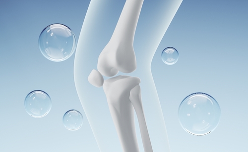 整形外科領域での栄養療法~骨粗鬆症に対する栄養療法~記事2025-07-18 12:00
 -
 東京のエボラ研究施設の移転が世界的な警鐘をならす: バイオ危機に備えるオーソモレキュラー戦略記事2025-07-17 19:14
 -
 折れない心身を育む~レジリエンス医学入門~記事2025-06-27 12:00
 -
 「医師と患者のためのオーソモレキュラー医学情報」 トランプ政権が「MAHAレポート」を発表 ~私たちのこどもたちを再び健康に記事2025-06-13 12:00
 -
 アルツハイマーが不運や加齢のせいではなかったとしたら?~アルツハイマー病を防ぐ方法~記事2025-06-06 12:00